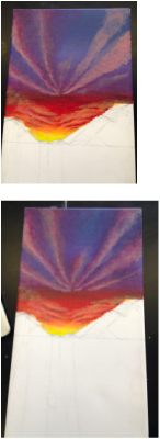
For the past few days, I have been working on painting the clouds and blending them into the background. For the shadows, I used a dark magenta and purple. With a smaller brush and with barely any paint on it, I made very short paint strokes in a dabbing motion. I wanted to make the darker shades of the clouds fade so I dabbed some paint into the sky. That way, the clouds would look more realistic. I didn't want the colors to stand out so boldly, so a lot of times I would use my ring finger to sort of smooth out the paint and create a hazy effect. I also tried to blend out the light, bottom layers of the clouds that I had painted earlier, since they seemed too bright. I dabbed a little bit of the sky color on the bottoms of the clouds to soften the lines and make them appear more natural. I tried to make them look more dispersed into the sky by blending the cloud colors into the background. As for the clouds closer to the mountains, I think I will just let them be and start on the water next time. Once I see the other components of my painting come together, I will be able to decide exactly how I want everything to look.
Today, I did the first layer of the sunset clouds. Not going to lie, I was actually really scared to start painting because I just didn't know how it would turn out. The clouds in the picture that I'm using as inspiration are not very defined and a little bit amorphous. My teacher recommended that I decide on a point of perspective because that's where all my clouds will be angling towards, "like a fan". Once I did that, I squeezed a layer of retarder on the the places I wanted to paint clouds on. For the color, I mixed white, yellow, and red together to create this peachy pastel color. In the photo it seemed that the peachy colors were essentially the bottoms of the clouds, and that the darker shades were the tops/shadows. I began painting the clouds near the mountains, using small dabbing strokes to keep the texture of the clouds light and sort of fluffy. I tried to paint them at a slight diagonal, thickening the cloud strip at the end because of perspective. Towards the top, I made the clouds a lot larger, continuing with the fluffy, dabbled texture. I also tried building up color at the bottom to really give the clouds more dimension. I realize now that some of the bottom clouds look like zebra stripes, but I plan on going back in and making them look less stiff and close together. For the next class, I will probably add another layer to the clouds and make sure they look very natural. I'll also paint some yellow to the bottoms to brighten the clouds up and then start painting the purples and blues on top. I think once I do that, it will make the clouds actually look like they are actually part of the sky and not just coming out of nowhere. Crossing my fingers!!
Today's post will be fairly short since, as you can see, I didn't do much with my painting. We began class with a short group evaluation where we all got to talk about our projects, share our concerns, and get/give feedback. We all seemed to have questions about how to paint clouds, so we watched a YouTube tutorial afterwards. After mentioning that I wasn't really liking the way the colors of the sky were blending together and transitioning, Mrs. Story advised me to use some retarder. On the places that seemed to need more blending, I squeezed some retarder. Next, I coated my paintbrush with a thin layer of paint and painted on top of the retarder, spreading it across the whole canvas. Slowly I moved upwards, making sure that I painted nice even layers. Then I repainted the whole top half of the sky to make it just a tad more vivid. With all my little alterations, I think my sky looks out a lot better. There's a neat gradient effect and the colors are more visually pleasing than before. My sunset sky definitely isn't perfect, but I plan to move onto the clouds next week, since they will add more dimension to my piece. Hopefully they turn out okay!
Today, I got straight to sketching and experimenting. I first picked out a 12x24 canvas, which seemed to be a suitable size for the painting. I decided to just put the primary colors yellow, red, and blue onto my palette. That way, I could blend them together to basically make any color that I might want. I did a quick sketch of the mountain ranges, making the lowest part of the ranges a little bit off center to make the painting's composition a little bit more interesting. I began with the yellow, and then added a dab of red into the yellow to get a light orange. As I worked my way up, I added more red, then blue to get a gradient effect from warm colors to cold. I noticed that in the pictures, the blue wasn't very vibrant like in the daytime, but rather more grayish. To achieve the intensity of the photo, I tried not making the upper shades of the sky too bright. I ended up adding some white to the upper layers to give off a more dusty, cloudy feel. Though the upper layers of the sky were dimmer, I felt that the warmer tones needed to be even more vibrant. I added some white to the yellow, but now looking at it I might try to brighten up the other warm shades, as well. After finishing my first layer, I noticed that there was a lot of streaks in the warmer shades. With the advice of my art teacher, Mrs. Story, I tried to take away some excess paint on the canvas and create thinner layers. Though I'm not totally satisfied with the blending and overall look of my sky, I hope that once it dries I will be able to go back and perfect things!
To start off our spring semester painting class, we've decided that our first painting will include the sky, among other subjects of choosing. Having just finished painting our own color wheels, the goal of this project is to master the different ways of working with color and its many shades in our paintings. I've always loved watching sunrises and sunsets on top of mountains, and when I searched those key terms I found myself gravitating towards pictures that had a lot of depth in them. In the first two pictures, I really liked how the bright warm tones of the sun peeked from mountains and then blended in with the cooler tones of the sky and clouds. In addition, I thought it was so pretty how the vibrant colors of the sky reflected onto the glassy water. The rocks underwater in the first picture are a really cool element in the photo's composition and I think that if executed properly will look amazing in the painting. As for the last picture, it helped me get a feel for the color palette of the sunset. I also found the clouds in it to be a nice touch that I could possibly include in my painting. Can't wait for tomorrow to test it all out!
Photo 1 Photo 2 Photo 3 |