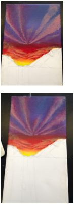
I personally have always preferred the mountains over the beach and to me the combination of mountain ranges, a lake, and a sunset is the perfect scenery. What I like so much about the mountains is its the placid atmosphere, and so I wanted to evoke that same feel through my own painting. In the pictures that I found inspiration in, I was automatically drawn towards the way in which the sky and mountains reflected into the glassy water. I also loved how the sun would peak out through the mountains and radiate. There is an obvious contrast between warmth and coolness shown through the colors. With the sunset, there were very warm-toned colors like yellow and red, but at the same time there were also very cool-toned shades of blue. I think that the contrast between warm and cool and dark and light actually makes the light, warm colors stand out more and look even brighter. Also I think that the dark, more neutral color helps to bring the mountains out. While the water and sky reflect off each other and share similar colors, the mountains break apart the symmetry. They introduce a level of coolness while the sunset gives off warmth that is then reflected onto the lake. To create a serene mood in my painting, I wanted everything to look very smooth. Retarder helped me a lot in getting nice even layers, especially for the water. Although the vibrant colors of the sunset stand out a lot, I didn’t want too many bold, contrasting colors. I think that the cooler tones that make up a substantial portion of the canvas are rather muted and help to illustrate a calm ambiance.
I am very content with the final look of my painting. I didn’t have very high expectations at first because I thought I would mess up a lot, but I’m very happy with how complete and cohesive it looks. I definitely think this project helped me, as an artist, understand color. With the sky and water, the use of secondary and tertiary colors really allowed me to produce a gradient effect. I think that the colors, though contrasting, are at the same time harmonious because they are not so intense and are painted in various areas of the canvas. A lot of the darker colors are actually leaning more towards a purple hue, making my painting look more cohesive. Also, I like the fact that the colors of the water and the sky are so similar because they help to bring everything together and give off a peaceful feel. Another thing I learned was how to avoid uneven layers of paint and the different ways of using retarder. I think the smooth texture makes the painting look very polished. However, I do think that I should work more on creating rigid texture to objects look more three-dimensional, for instance the mountain ranges. The mountains could have loomed more realistic and developed. Also, I wish that I could have made my water look just a tad more transparent, perhaps by putting gloss on top. But, regardless of its many imperfections, I'm glad to be moving on to our next project!
I am very content with the final look of my painting. I didn’t have very high expectations at first because I thought I would mess up a lot, but I’m very happy with how complete and cohesive it looks. I definitely think this project helped me, as an artist, understand color. With the sky and water, the use of secondary and tertiary colors really allowed me to produce a gradient effect. I think that the colors, though contrasting, are at the same time harmonious because they are not so intense and are painted in various areas of the canvas. A lot of the darker colors are actually leaning more towards a purple hue, making my painting look more cohesive. Also, I like the fact that the colors of the water and the sky are so similar because they help to bring everything together and give off a peaceful feel. Another thing I learned was how to avoid uneven layers of paint and the different ways of using retarder. I think the smooth texture makes the painting look very polished. However, I do think that I should work more on creating rigid texture to objects look more three-dimensional, for instance the mountain ranges. The mountains could have loomed more realistic and developed. Also, I wish that I could have made my water look just a tad more transparent, perhaps by putting gloss on top. But, regardless of its many imperfections, I'm glad to be moving on to our next project!


 RSS Feed